Who would have thought a phone would come along that could make even the mighty Samsung Galaxy Note 4 seem boring? For all its top-notch features, the Note 4 lacks the one big thing that its new sibling brings to the market – a curved screen. It’s instantly iconic: the gentle glass that seems to flow right off the edge of what should be the front of this phone. The seamless continuation of pixels is truly remarkable, and anyone who sees this phone for the first time will gape and stare, turning it around in their hands and holding it up to their eyes for closer inspection. That’s the kind of draw it has.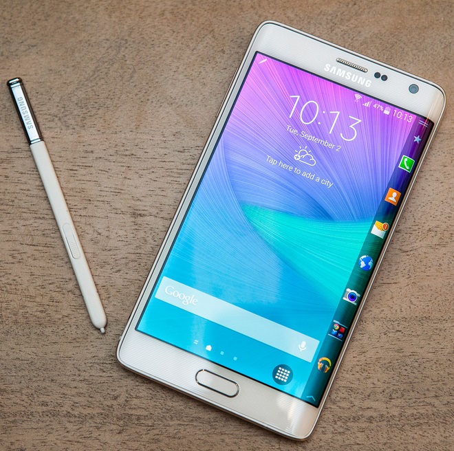
In a world of cookie-cutter smartphones (to which Samsung is probably the most prolific contributor), the new Galaxy Note Edge really does stand out. We’re really eager to see what purpose the curved screen serves, and whether this phone’s functionality matches its appearance.
Look and feel
Finally, Samsung has been forced to do something different with the physical design of one of its phones. The gently tapered right edge is certainly interesting, but you might not really see what’s going on at first glance. Most of all, it’s the asymmetry that really catches the eye. A metal rim frames the screen as it curves around, but it protrudes a bit on the right to protect the screen and therefore also digs into your palm. Phones usually have gentle curves on the back so that they fit comfortably in a hand, but there’s no way to do that on the screen side of the Galaxy Note Edge.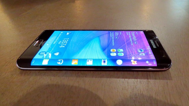
The rest of the design is typical Samsung – an oblong Home button ringed with silver beneath the screen, a silver earpiece with the sensors and front cameras clustered nearby, and patterned plastic all around. The rear also has the faux leather texture that has been a staple of Note devices for ages now. A heart rate monitor is integrated into the flash cutout right beneath the rear camera lens, and the Home button’s surface doubles as a fingerprint reader. If not for the screen, this phone would have been utterly boring to look at – in fact, Samsung might not have done its new showpiece justice by giving it such uninspired surroundings.
As a result of the unique design, the power button had to be moved to the top. While most phones had their power buttons here till oversized screens became the norm, it’s especially difficult to reach with one hand because of the uncomfortable right edge. The volume buttons are on the left side, and the Micro-USB and 3.5mm ports are on the bottom and top respectively, as usual. The S-Pen silo is also on the bottom and there’s a cutout on the rear to help you pull it out with a fingernail.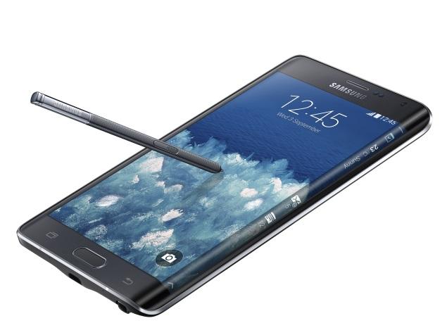
This is a large, hefty phone, even by today’s standards. Left-handed people will have trouble holding it in one hand while using the S-Pen. Despite the use of Gorilla Glass 3, we’re really uncertain about how the curved screen will hold up if the phone itself is dropped.
Specifications
The most interesting part of the Galaxy Note Edge is of course its screen. It has a total resolution of 1600×2560, divided into a standard 16:9 1440×2560-pixel area for the main interface and an additional 160-pixel-wide strip on the side. There is no visible seam between the two areas – it really is one single continuous panel. The divisions you see are purely down to how the phone’s software handles things.
Even without the curve, this would be a very impressive screen. It measures 5.6 inches diagonally, which accounts for the extra width compared to the 5.5-inch 1440×2560 screen on the Galaxy Note 4 (Review | Photos). It’s bright, crisp, and easy to read in all kinds of environments.
The Galaxy Note Edge is powered by a quad-core Qualcomm Snapdragon 805 running at 2.7GHz, with integrated Adreno 420 graphics. There is 3GB of RAM and 32GB of storage, which can be bumped up by 128GB using a microSD card.
There’s a 3,000mAh battery and a whole raft of sensors. You also get Wi-Fi b/g/n/ac, Bluetooth 4.1, Infrared, NFC, and GPS.
Software and usability
Samsung ships the Galaxy Note Edge with Android 4.4.4 and a version of its well-known TouchWiz UI skin tailor-made for the curved screen. In terms of the S-Pen stylus, the Galaxy Note Edge has all the same features and functionality that the Galaxy Note 4 has – no features have been reserved for either device.
The first thing you’ll notice when you turn on the Note Edge is the vertical row of shortcut icons on the curved end of the screen. In fact, there is no dock on the bottom of the screen and no app shortcuts anywhere else on the home screens. The strip looks like a natural part of the TouchWiz UI, but the device’s size and proportions combine to make the upper icons difficult to reach. As a concession, there’s a duplicate Phone icon in the lower left corner of the screen and a button for the app drawer in the lower right corner.
Samsung has filled the homescreens with widgets and panels advertising its own apps and features, such as health monitoring via the built-in sensor (or a paired Samsung Gear wearable device). The leftmost homescreen is a tile-based newsreader very much along the lines of HTC’s BlinkFeed.
We quickly set about experimenting to see how the extra strip of screen space (called “Edge Screen”) could be put to use. Seven shortcuts are visible, though you can have up to 20 if you’re willing to scroll. A grab handle on the top can be pulled down to reveal non-customisable shortcuts to the voice recorder, torch, stopwatch, timer, and of all things a ruler (that is presumably calibrated to the exact screen density of the Galaxy Note Edge). A handle on the bottom shows a shortcut to the overall Edge Screen settings.
Swiping left or right will cycle through the available panels, and you can choose which ones show up. There’s the main notifications panel, a pedometer display, Twitter trends, quick contacts, assorted topical news feeds powered by Yahoo, and even a memory match game. A “Now Playing” panel pops up when you use the default music app.
Samsung has considered its next steps in this regard and so there’s a link to download additional panels. These are typical little widgets, including a task manager, RAM usage counter, data usage counter, weather readout, calendar, CNN news feed, and a few more games.
Functionally, there isn’t much difference to Edge Screen panels and ordinary widgets. The main thing is that you get to use them while other apps are running. The Edge Screen is also designed to be visible when the phone itself is in a case, or just lying on your desk.
Panels are a little wider than the 160 extra pixels the screen provides. When apps are open, they disappear to be replaced by a black strip, and if you swipe left or right, they’ll slide back in with a slight overlap. The black strip can be customised with text that’s always visible, but this made no sense to us since it was severely distracting when we tried playing full-screen videos and games.
You can also create a custom panel that will show up when the screen is locked. Ideally, you should use one of the default wallpapers which will line up perfectly with the primary screen’s wallpaper. We aren’t sure why Samsung doesn’t allow the primary wallpaper to extend to the Edge Screen area, since it’s part of the same continuous panel.
Samsung has also come up with other ways to use the extra screen space. For example, all controls in the camera app are moved to the curve area – honestly, this isn’t much of an improvement since the Galaxy Note Edge is even harder to hold than regular large phones, and this puts most buttons out of easy reach. While the Music panel overlaps the music app and offers duplicate controls, the Videos app displays its primary playback controls in the “spillover” screen area. Very few other apps seem aware that there is extra screen space and it is unclear whether Samsung will give third-party developers the ability to extend into it.
Notifications and incoming messages show up vertically on the Edge Screen, which can be a bit annoying since you wind up twisting your neck or fumbling with the outsized device. When your phone rings, caller ID info is displayed here and you have to swipe up or down to answer or reject calls. This means you have very small touch targets, that too in a place that’s awkward to reach.
Incidentally, the Android status bar isn’t visible when you rotate the phone into landscape with the Edge Screen on top, but is the other way around. This can be a little confusing.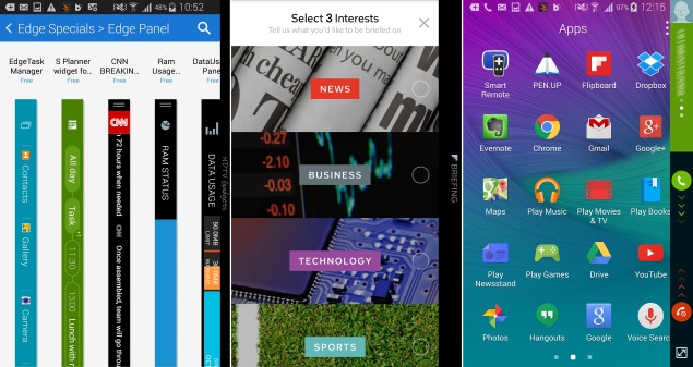
There’s also one major issue with the curved glass – it is absolutely impossible to avoid reflections. Usually you can find an angle that works for you, but with the Galaxy Note Edge there will always be some part of the screen that reflects too much. Your eyes are also automatically drawn to the curve, which can be distracting.
Other than the Edge Screen, there is of course Samsung’s S-Pen functionality and all the usual TouchWiz extras. You can read all about them in our review of the Galaxy Note 4.
Performance
The Galaxy Note Edge has flagship-class hardware and did not fail to impress us as far as performance goes. The QHD screen is just flat-out gorgeous, and is easily at par with the one on the Galaxy Note 4. Being a part of the Note family, we obviously have high expectations of the Note Edge. Samsung didn’t have to go super-high-end with its first curved screen but it did, and there have been no compromises in order to accommodate it.
We had a generally pleasant experience with the Galaxy Note Edge throughout our time testing it. Sure, it’s a little awkward to hold and we were much more worried than usual about dropping it, but we couldn’t help but fidget with the Edge Screen and just run our fingers over the curved glass from time to time.
Benchmark scores were very good across the board which should come as no surprise since the hardware is pretty much the same as that of the Galaxy Note 4. We recorded 49,198 points in AnTuTu and 25,099 overall in Quadrant. GFXbench ran at 26fps on the QHD screen, which is pretty impressive. 3DMark Ice Storm Extreme maxed out, and Unlimited gave us a score of 19,736. SunSpider was also very snappy, finishing in only 782.3ms.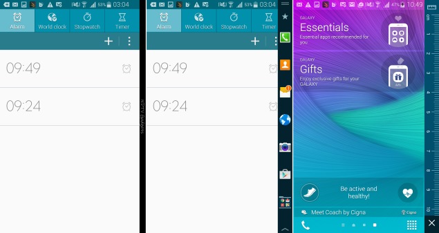
Videos look great and we had no problem running heavily encoded samples. The main problem was that the Edge Screen curving off into the distance and the resulting asymmetrical border around the screen are even more distracting in landscape. Your eyes are just automatically drawn to the curve. Full-screen games become awkward thanks to the phone’s unususal grip, the reflection problem, and the fact that a little bit of the primary screen area tapers into the curve.
The Galaxy Note Edge sounded fine in calls and its speaker was mostly adequate for whatever we threw at it. Battery life was very good at 14 hours, 15 minutes in our video loop test, though this was below the Galaxy Note 4’s even more impressive mark of 15 hours, 11 minutes.
We like the Galaxy Note Edge’s camera just as much as the one on the Note 4. Optical image stabilisation is a huge advantage and 4K video is nice to have even though enormous file sizes make it impractical for most purposes. We were able to take some very crisp, detailed photos in low light. Shots taken in daylight were also generally very good. We noticed some slightly aggressive compression that resulted in a lack of clarity on metallic surfaces. Camera settings are just as extensive as those on the Note 4.
Verdict
Buyers have not had something truly unique to experience (and to show off) in a very long time. The Galaxy Note Edge represents a remarkable technological achievement and is exactly the sort of product that will make people do a double-take when they see it for the first time. In that way, it successfully breaks out of the mold.
However, it seems as though Samsung is grappling with multiple ideas of what the Galaxy Note Edge is supposed to achieve. The Edge Screen panels are just sort-of there because something needed to be done with the curve. They could work just as well as panels on a secondary screen, or a dedicated area of any normal flat screen. We did not see any app that truly took advantage of both, the extra screen space, and the dimensionality of the curve.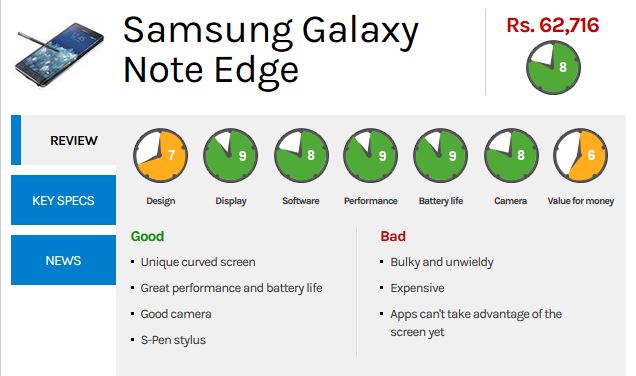
Even in terms of functionality, the Edge Screen panels are more similar to what you might find on a smartwatch than to regular Android homescreen widgets. There’s also a lot of duplication, which makes the Curve Screen feel more disjointed than it actually is. Wider support is desperately needed – though of course now that Samsung has successfully mass-produced this screen, only imagination can limit where it will go from here.
In many ways, Samsung is stuck because it is dependent on the Android ecosystem which really doesn’t accommodate such unique features. Until the curve and screen space are truly exposed to third-party apps, we’ll likely see more disjointedness.
All of this means you might want to think very carefully before spending an enormous amount of money on what is essentially a first-generation experimental product. The Galaxy Note Edge is undoubtedly one of the coolest-looking phones of its generation, and if that’s the only thing that matters to you, then by all means, go ahead and buy it. If not, you can get pretty much all the same benefits and also save a ton of money by going with the woefully one-dimensional though still excellent Galaxy Note 4.


