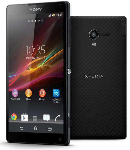
Having finally scored a homerun, and a desperately needed one at that, Sony is keen to bring another hitter off the bench. And they sure hope it’s the Cadillac-driving kind. The Japanese mean business – and the Xperia Z did its best to get that point across. The Xperia ZL now has plenty of momentum to build on but a certain weight of expectations too.
The double-backup is something Samsung has been doing for a couple of years now with a Galaxy S flagship in the spring followed by a Note phablet at the end of summer. Sony’s going for what looks more like a one-two punch with the glass-clad, water-proof Xperia Z and the more compact, less extravagant, but just as premium Xperia ZL. The timeframe for their arrival to market has been shortened too – pretty much a must, considering that chipset is only getting older.
Sony needs users to like the ZL, because the Z probably won’t make it on its own. On paper, the Xperia ZL has all the trimmings of its sibling save for the IP57 certification. And it should be just as capable as most other flagships of the latest generation. Here go the specs.
Key features
- Quad-band GSM/GPRS/EDGE support; 3G with HSPA; LTE
- 5″ 16M-color 1080p capacitive touchscreen of 441ppi, Mobile BRAVIA Engine 2
- Android OS v4.1.1 Jelly Bean with custom UI
- Quad-core 1.5 GHz Krait CPU, 2 GB of RAM, Adreno 320 GPU; Qualcomm Snapdragon S4 Pro chipset
- 13 MP autofocus camera with LED flash and geotagging, HDR
- 1080p video recording @ 30fps with HDR mode, continuous autofocus and stereo sound
- 2 MP front camera, 1080p video recording
- Wi-Fi a/b/g/n, Wi-Fi Direct and DLNA; Wireless TV out
- GPS with A-GPS, GLONASS
- 16GB of built-in storage; microSD card slot
- MHL-enabled microUSB port
- Bluetooth v4.0
- NFC
- Standard 3.5 mm audio jack
- Accelerometer and proximity sensor
- Active noise cancellation with dedicated mic
- Shorter footprint than most 5” smartphones
Main disadvantage
- Non user-replaceable battery
- Uninspiring camera performance
- Notably thicker than Xperia Z
- Dubious back panel build quality and aesthetics
If you’re after a FullHD five-incher the Xperia ZL is the most compact handset that fits the bill. The difference, of course, is by no means huge but having a smaller footprint than the Samsung Galaxy S4 is a great achievement. On the other hand, a 10 mm thick body is nothing to brag about. Yet, if that’s the price for getting a proper shutter key and an Infrared port, it should be fine for most people.
Anyway, Sony opted for two distinct versions of a 2013 flagship and then had to sit down and think about how to make them… distinct. Having a more compact option of what’s virtually the same package as the flagship makes every bit of sense. But is it worth the extra millimeters around the waistline?
It was probably important to Sony to send a clear message that what’s on offer is essentially the same package – the difference boils down to size, choice of finish and waterproofing or not. A sensible plastic case doesn’t look half as good as glass but has its advantages. Water resistance is a great asset but not everyone needs it. Plus… a proper shutter key, half press and all, is something we always welcome in a cameraphone.
Unboxing the Xperia ZL
The Sony Xperia ZL comes in an identical box, in terms of both design and contents, to that of the Xperia Z. Our Xperia Z unit came with a complimentary 2GB memory card, which the Sony Xperia ZL doesn’t have, but that’s hardly a big deal. You do get an A/C adapter, a microUSB cable and a headset with an extra pair of earbuds
Design and handling
The smaller footpring is probably the first thing the Xperia ZL will use in its defense, as many users are likely to question the absence of high-end finish. If recent history has thought us anything, it’s that there are enough people who value handling over fancy design. We, for one, are not too fond of the textured battery cover but plastic is clearly something you don’t have to worry about as much as you would for the glass rear panel on the Xperia Z.
The Sony Xperia ZL is being pitched as the most compact smartphone with a 5″1080p screen and the amount of space below and above of the screen is an easy to spot difference to the Xperia Z. The top and bottom bezel have been noticeably shrunk and that’s perhaps the reason why the front camera is located in the bottom right corner – a bit unusual, but not unprecedented (remember the Nokia N9?). The side bezels too have been reduced to the bare minimum.
The chrome insets on the sides of the handsets are one of the few similarities with the Xperia Z. The reflective plates are a nice accent and come in the same light graphite color as on the water-resistant Xperia.
Sony is using a similar simplistic front on the Sony Xperia ZL with no hardware buttons on the glass. Capacitive on-screen controls are used instead that stay out of the way while browsing the web or viewing images, playing games or watching videos.
.


